London Beer Factory – IPA can design and product branding
What I did: Illustration, graphic design, art direction, research, mockup, experimentation, idea generation
My part of the project
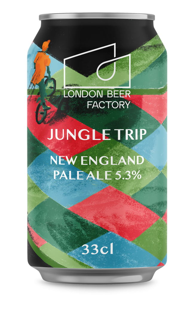
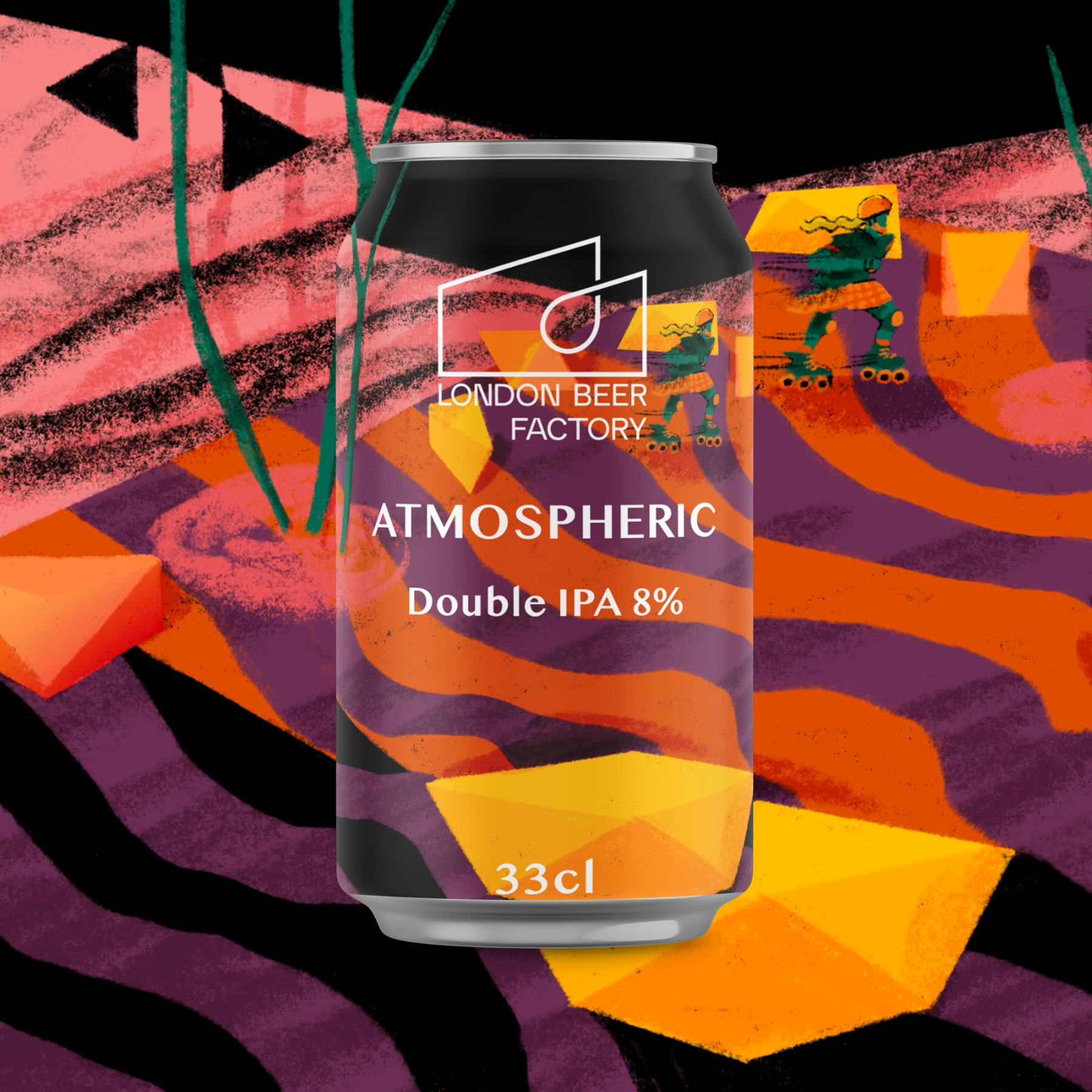
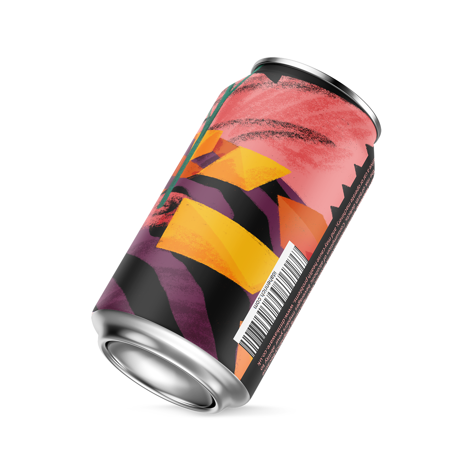
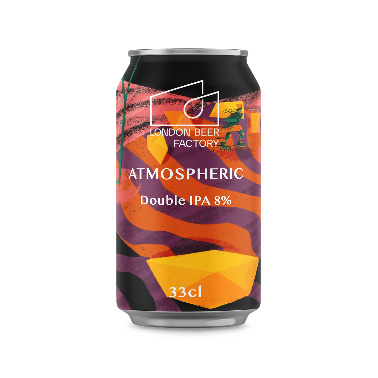
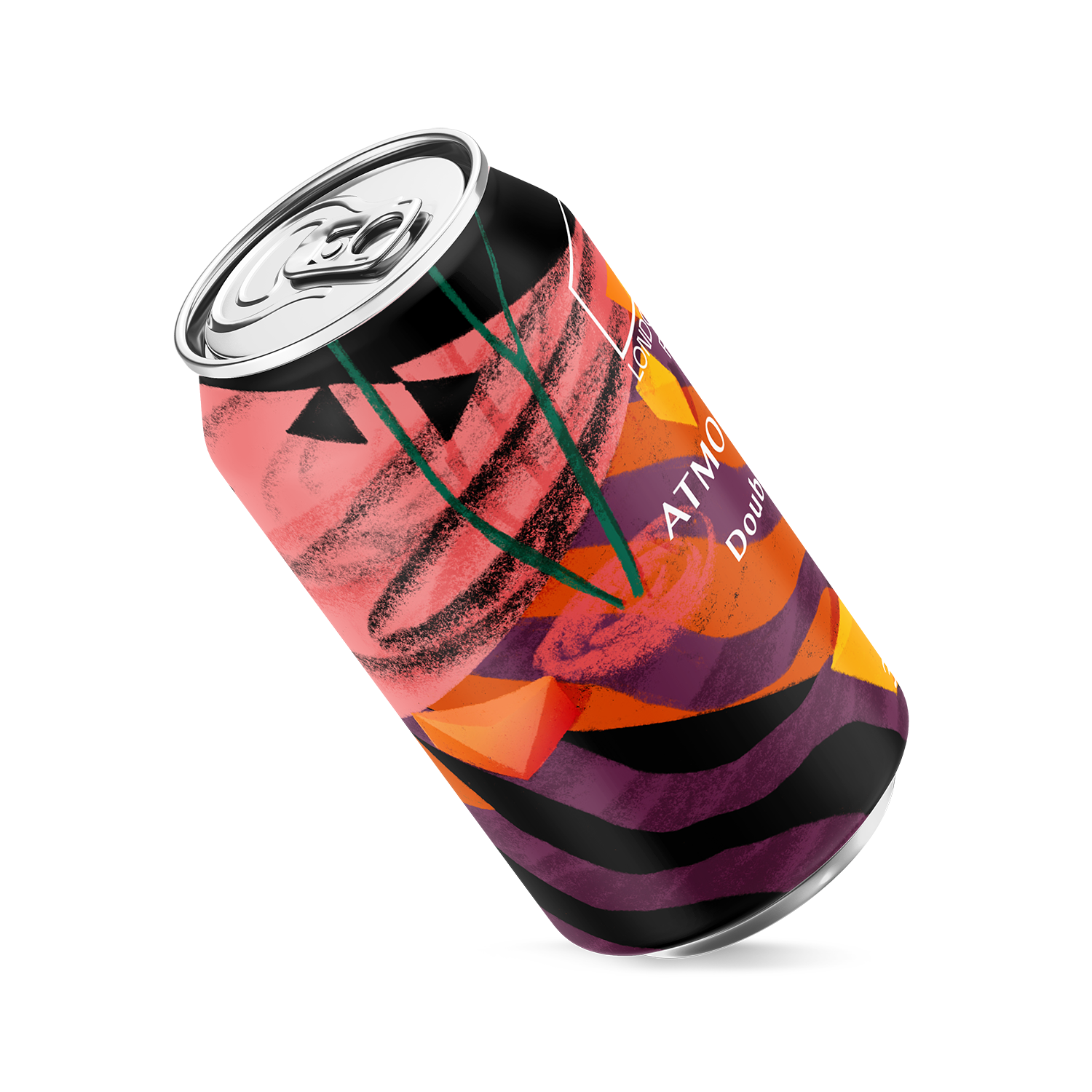
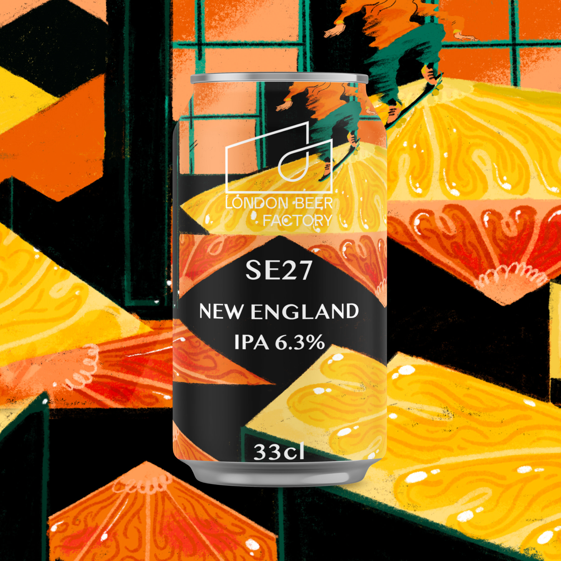
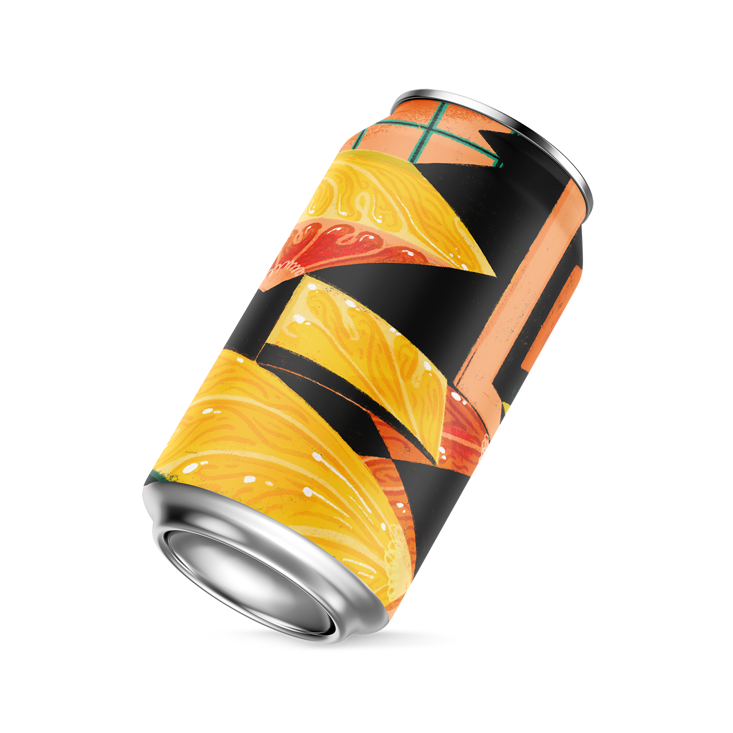
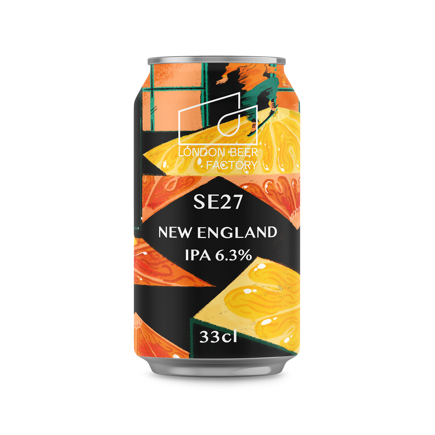
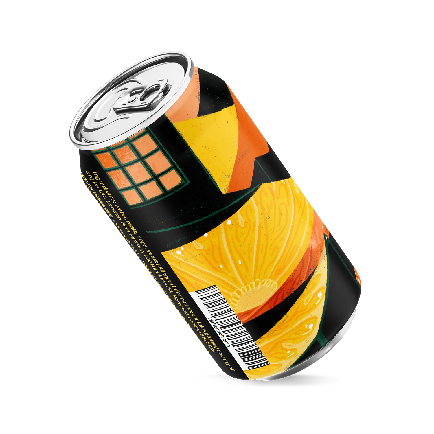
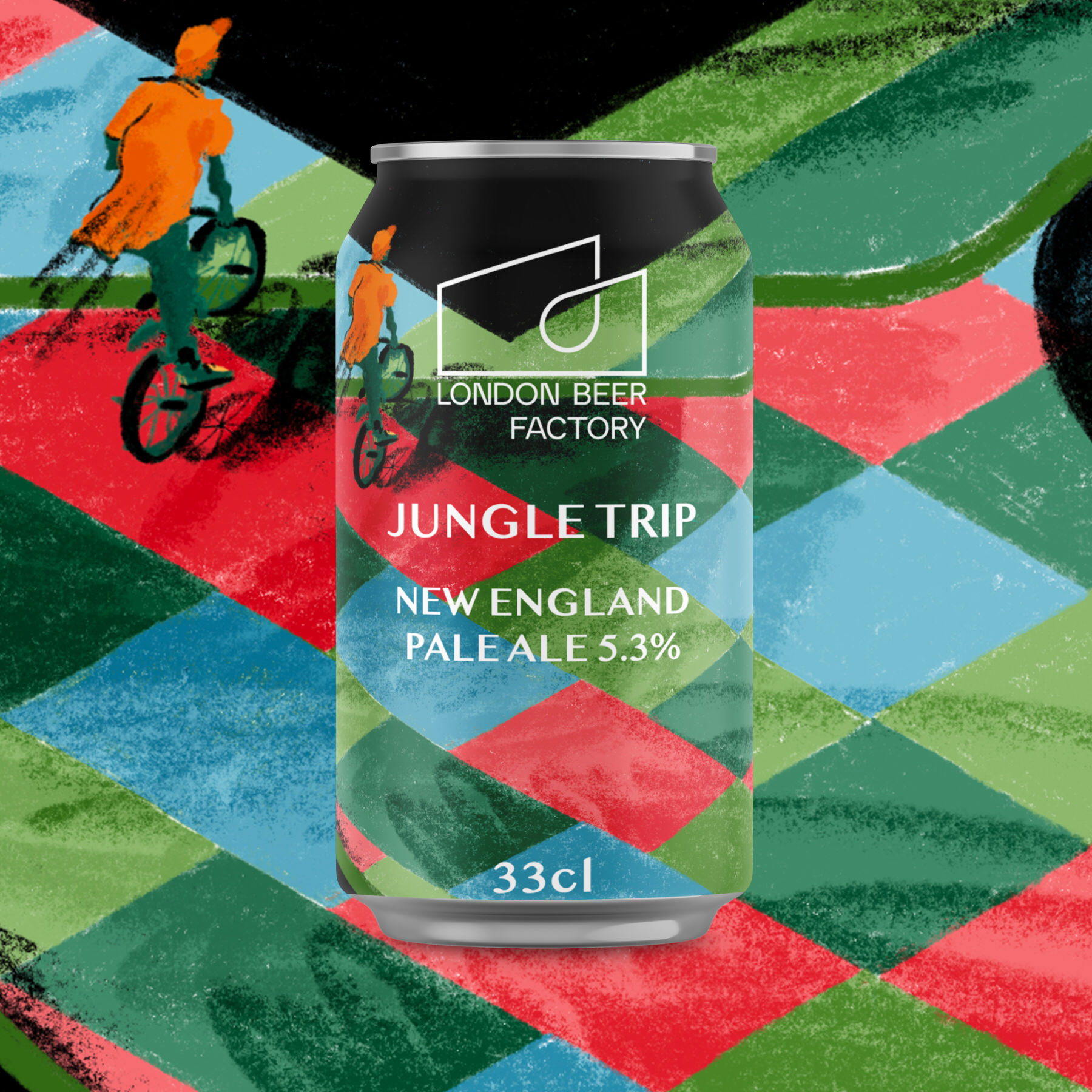
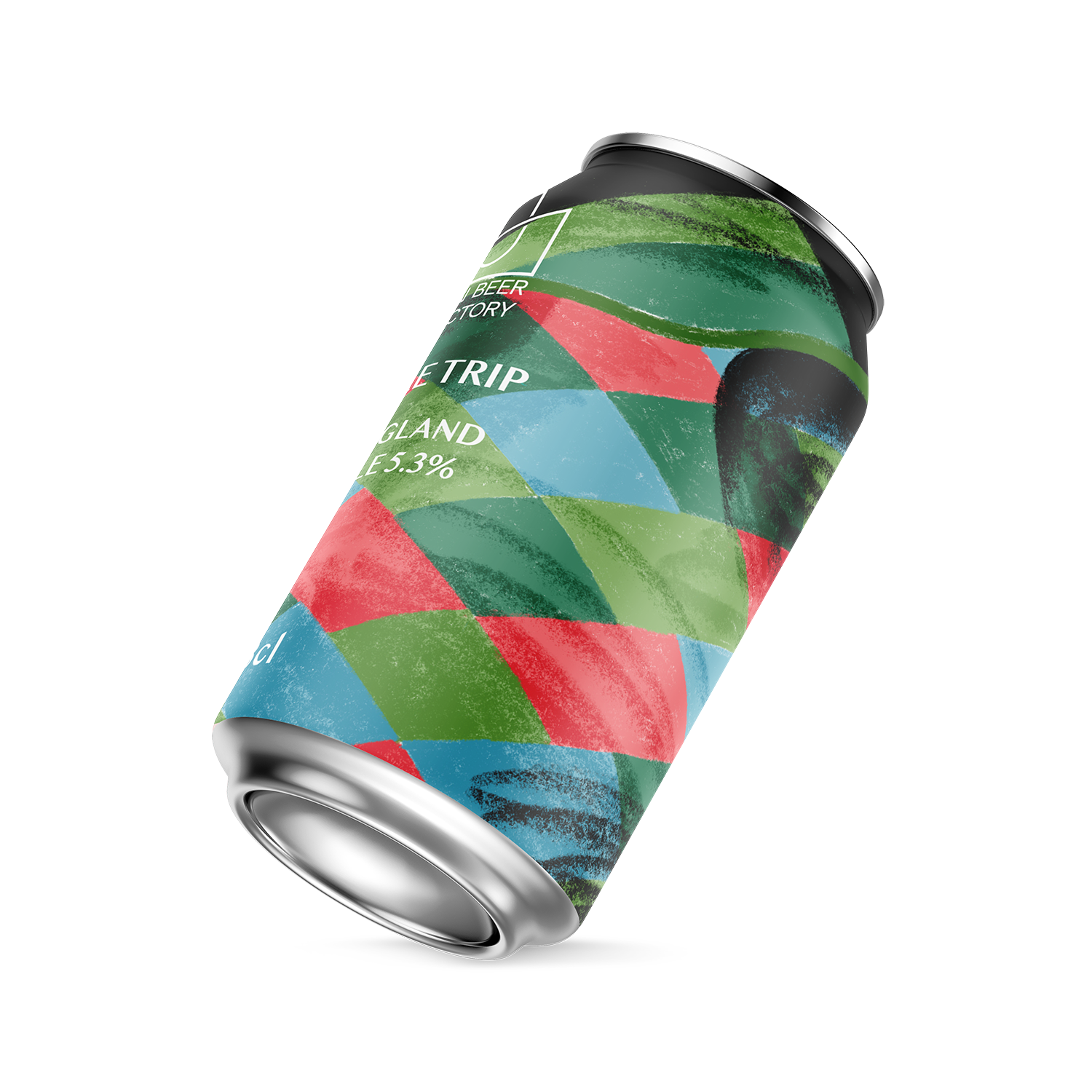
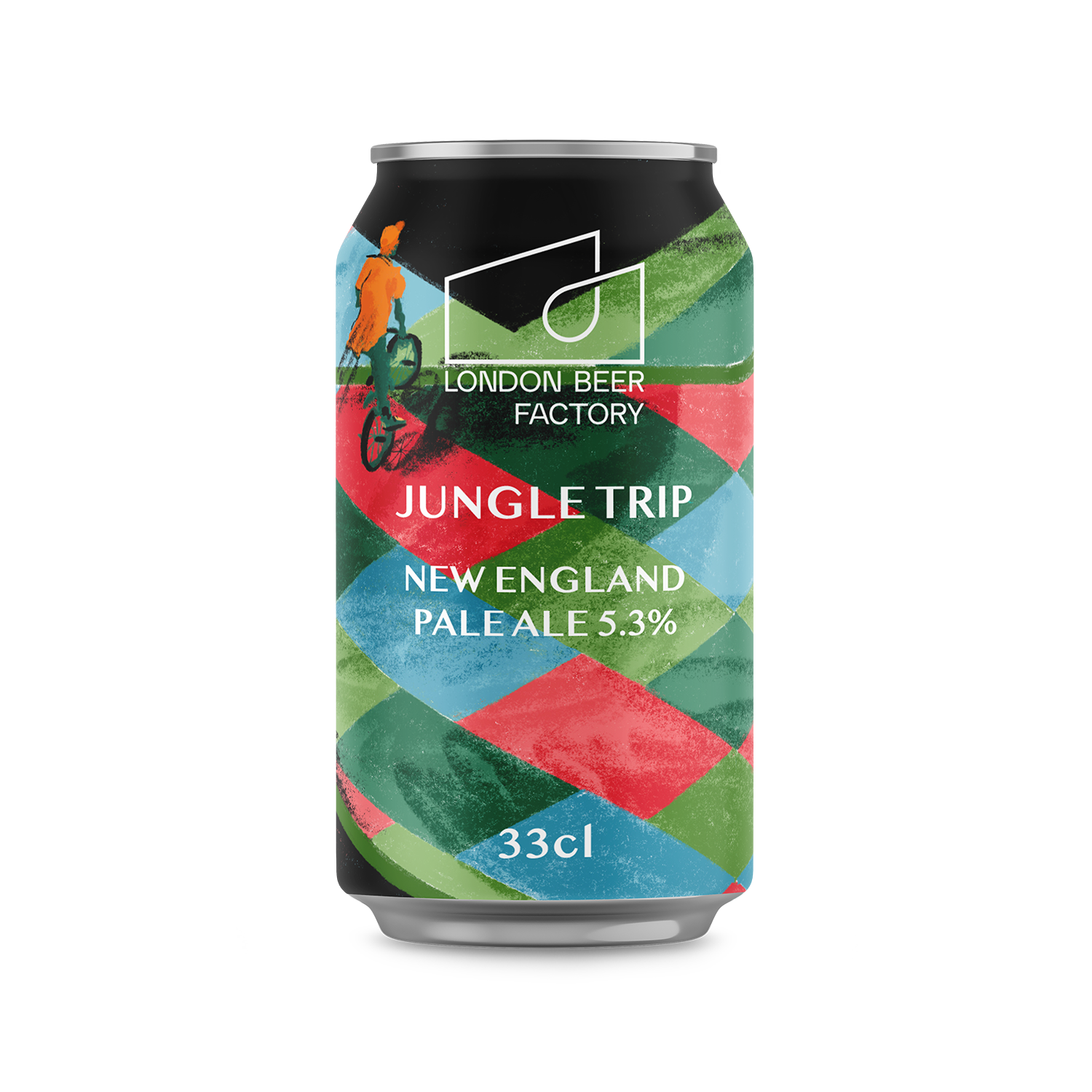
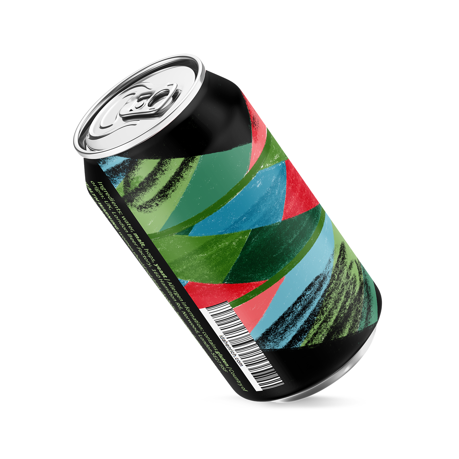
This project is all about celebrating craft, in beer and skating culture. I was inspired by the London Beer Factory’s delicious IPA selection and by the organisers of the London Beer Festival to create artworks that celebrate practice and continuous improvement. Within my research into the London IPA scene, I found that BMX biking, inline skating and skateboarding are popular hobbies. I also found that a sharp geometric style and colourful beer cans were popular amongst IPA drinkers. As the London Beer Factory’s branding is usually vivid colours on a black background I decided to stick to this look, to keep brand consistency. As IPAs are fresh and bright flavours I choose bright citrus colours and stone fruity purples for my designs which contrast nicely with the black background.
This personal project was all about enjoying the research and playing with visuals to create something new and on-brand.

 Copyright Ida Henrich. All rights reserved. This image is for publication on Ida Henrich’s website only and must not be used for another purpose. Use for another purpose by a third party is an infringement of Ida Henrich’s copyright.